Thursday 18 April 2013
Feedback and re-shooting.
After getting the feedback from the class and from Leanne we decided to re-film our title sequence in the easter holidays. We wanted to improve on the acting and the location considering a lot of the filming was done in school and it was obvious in some scenes.

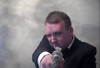
On Thursday 11th April we filmed our title sequence again. We ensured our protagonist seemed stereotypical by giving him a smart suit to wear. We wanted to make the whole title sequence have stereotypical spy features so we ensured we involved guns, women (who gave him his drink) and also we wanted to make him seem like a 'ladies man' therefore we had him do a couple seductive winks at the camera.

We wanted the new title sequence to be more humorous then our last one and so we made the main character seem clumsy in some scenes for example we made him seem like he couldn't handle the gun he was using, we made him do funny actions when he shot including him hurting himself and we also made him do things which included him hiding behind a thin tree which was clearly to small for him.
 I feel like filming on Thursday was incredibly successful as we got every shot we needed done. I feel like this new title sequence has improved a lot and I feel that we have improved on all the negatives we were given during the feedback.
Thursday 14 February 2013
Feedback.

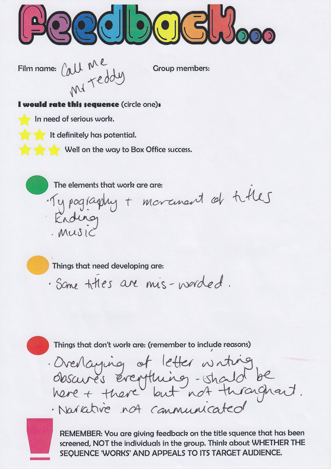

This is the feedback we got from the class after we showed our sequence. One of the main comments were that the audience didn't understand what the film would have been about, after receiving the feedback we decided we agreed with this because we obviously new what the film was about so we didn't really take that on board as much when making the title sequence. And the other main comment was that the music was suitable, we did like this comment because we had worked hard analyzing other music to try and find the perfect one to our title sequence.
Friday 1 February 2013
30.1.2013
This video shows me, Nicola and Louise explaining the difficulties we encountered and how we over come them.
Sunday 27 January 2013
Transition research.
Johnny English

- The Johnny English title sequence had text which comes onto the screen for a certain amount of time, long enough for the audience to read it and then it moves to the side as it is running of the screen. I think this suits the genre of the film really well, in my opinion it could resembles chasing after someone, speed and action.
James Bond - Quantum Of Solace

- In the title sequence for Quantum Of Solace the text comes up which relate to the type of film, each letter moves slowly yet swiftly, not all the letters come up at once some pop up before overs which make it kind of look like codes and riddles. This reflects on the film.
Mission Impossible

- When the text in the opening title sequence comes up for Mission Impossible it has the text running through the background and also text in front coming towards you. The behind text seems like it is running away some how and represents the action and the text in front seems like its coming towards you like its going to get you, it also seems like it is closing in on itself.
Friday 25 January 2013
Transition ideas.
For some ideas for the transition we decided maybe we could have the text appear on the screen for a while and then speed off the screen, I feel this would be a good idea as part of the film could involve 'Mr teddy' being on the run or running after people considering he is a spy it also represents the action genre.
Another one could be it bouncing around because its fun and would be a fun feel to the film although there could be a problem of it not being able to be seen by it moving too much.
One more could be the text fading in and out although I would find this a bit boring and I don't think it would reflect on the film other then maybe the villain hiding from Mr Teddy himself, I don't think its fun or will reflect on the theme.
Colour.


Today we decided to change the colour red in out font to white, in my opinion I think this is the best thing to do because the red doesn't stand out as well as the white does. We feel the white is best as the white is bright and will reflect on the personalities of the main characters as they will stand out from the crowd as clumsy.
24.1.13

Re-filming
In todays lesson we re-filmed a couple of scenes including the scene were our actor picked up the brief case and money fell out and also the scene were we see our actor at a desk working hard and we pan in to the 'Mr Teddy' logo. We had to re film the scenes because we didn't like the green screen as it didn't look professional and also the dolly looked incredibly wavy it didn't go in a straight line at all. But filming was a success and we got the scenes that we needed in the end.

Title font.


This is our chosen font for the cast and crew, we used simplicity. In my opinion this is a neat font and it doesn't look overly childish, we were looking for a font to resemble his personality and we think this suits it incredibly well. Its neat enough to be serious, spy like writing but at the same time it not so professional. Also it is easy to read for our younger audience.

Thursday 17 January 2013
Journal 11.1.13

Journal 10.1.13
Brief case scene

In this lesson we decided to film the last scene to our title sequence we wanted a ring to slowly fall into the 'brief case'. This part was successful we tide a piece of thread to the ring and lowered it down slowly, this was perfect because you couldn't see the thread so it looked like it was falling on its own which is exactly what we were aiming for. We also wanted to film money falling out of the folder and we tried multiple ways to try and make this happen for ample we stuck black card to the 'brief case' but that didn't work as the card was too visible so we had our actor hold the coins and as he picked the case up he dropped the money behind looking like it was falling out of the case. As we dropped the money on the floor it didn't look as good as we had hoped because we couldn't see the money as well as we had liked so we decided to add another shot were we had a birds eye view of the green screen and we dropped money don.

Journal 7.1.13

In this lesson we researched into green screen and how to use it, we watched a video to give us a brief idea on how to use it, how it works, etc. The video we watched was actually really helpful and covered most things we needed to know, it was also easy to follow as it went through step by step.
Tuesday 15 January 2013
Journal 10.01.13
The phone scene
Our aim for this lesson was to film a phone on the green screen then after give it an effect of blowing up an exploding, we started by filming this, we out the phone on the table and the green screen behind it, our first problem was that the reflection of the camera was in the phone screen so we put the camera at an angle and put a piece of black card in front of the phone so it didn't have a reflection. We had a few things wrong with this one of them being that the table was still in shot therefor the whole back of the phone wouldn't come through and we wouldn't be able to change it because the table obviously wouldn't be able to be changed.

Another reason why this scene failed is due to when we finally edited it and put the fire in the background we realized that the phone was black and also was the background leaving the phone not very visible. This left us having to go back and film the shot again but using a whit phone to improve it.

This is the scene we shot to improve on the previous...

Journal 7.01.13
In this lesson we shot a number of scenes including the water gun and also the granny picture sinking. The first we shot in school then went back to my house to film the sinking scene which we went on to actually not use unfortunately.

This was us filming the the water gun scene at first we set up so the camera was close up to the window and tom was shooting the window with water in hope it would look like he was squirting the camera but this unfortuantely failed due to the reflection of the camera in the window which you can see in the image above. So we fixed this problem and filmed it differently for example we got a piece of asotate and put it infront of the camera and then got the actor to shoot the camera leaving the camera protected and we still got the scene we wanted.

After we shot the scene in school myself, Louise and Nicola came back to my house to film this as Tom was unable to attend. This was cut because it didn't come out as expected and we would have preferred it all be swift and fit together but it was too hard and we was unable to film the photo sinking down in the centre of the screen as we wasn't able to see what we was filming due to the camera being underwater.
Journal 20.12.12
Soundtrack and Editing
When it came to the soundtrack our group had an idea as to what we really wanted, we had discussed this as a group before we started editing. The website we used to track down our soundtrack was https://audionetwork.lgfl.org.uk this was to ensure we avoided copyright. As a group we decided we wanted a soundtrack which was an upbeat tune and we also wanted it to convey the main characters personality.
We chose a few sounds which stood out to us and here they are...
City Streets - We discussed this sound and we decided that it was too techno and it didn't really appeal to our target audience which is what we was trying to avoid.
Agent x - When our group discussed this soundtrack we decided it was overly inappropriate for our chosen target audience. It also doesn't fit correctly with our chosen genre.
Alone in Love - Our group thought that the sound pursued some sense of sadness which was not at all what we was looking for. The group also mentioned that the era was slightly wrong.
Follow that car - This is the soundtrack that we finally chose, the reasons for choosing this is that its upbeat and exiting which resembles the main characters traits and also it goes with the spy feel of the film.
After we chose the final soundtrack we decided to edit it over our scenes we had filmed already. That was when we decided our chosen soundtrack sounded perfect and sunk in with the scenes we had already filmed. The other things we did which included editing was sorting out the speed which our clips went and we insured that the clips we had moved swiftly together.
Journal 10.12.12

Today we started shooting our first scenes, the succeses of today was that we was able to get a few scenes filmed. The thing which was unsuccesesful was the fact it wasnt a good location for the green screen for example the camera films outside of the green screen because it didnt cover the whole wall and also the sun is shinning throught the screen leaving the screen to be light in some areas and dark in the others.
Whilst filming this we used a dolly to go in on our actor swiftly and smoothly, the thing which was hard about using the dolly was that it was a struggle as we had to move the camera down to show the actor and it was hard to do so whilst the dolly was still moving but other then that we managed to film what we needed exactly how we wanted.
The next thing we intend to do is film in the sink and also use a water gun to shoot the camera.
Monday 14 January 2013
Fonts
As a group we have chosen a few fonts and here are a few examples of our favorite ones. The style we were aiming for was slightly childish as we want the font to come off on his personality and also we wanted the font to be manly so it wouldnt seem too feminine as the main character is indeed a man. We have also created a tally to see what the publics opinions of our chosen fonts were but these are a few things that our group thought.
Font 1

- Our group all felt as if this font was far too feminine and swirly, even some of the public agreed with us we were told it was too much like someones signature. The font also didn't have what we were aiming for, for example we wanted a font which showed the film as not serious and also we wanted it to be suitable for children and we thought that children wouldn't be able to quickly read this font when it flashes on the screen.
Font 2

- To us this font kind of conveyed horror due to the scratching effect it has to it and also it didn't really seem like an adult had written it which is what we had aimed for.
Font 3

-This text seemed too childish and didn't appear like it would be in a film with a spy although we were aiming for a text which had a childish edge to it the childishness as a little too over the top. This type of text wouldn't appeal to our secondary audience of parents and also older siblings. To be honest this looks like a font out of a children's product which leave us to think it is far too young for our target audience.
Font 4

-This was our favorite font and the one the public chose as their favorite too. This font resembled hand writing and thats one of he things we liked. Our group liked the fact it looked like a male yet childish hand writing as that is what we were aiming for so it came off as the protagonists personality. We also liked the fact it was very spacious between letters which will help the target audience as it will be easier to read.
Friday 11 January 2013


Subscribe to:
Posts (Atom)