Thursday, 14 February 2013
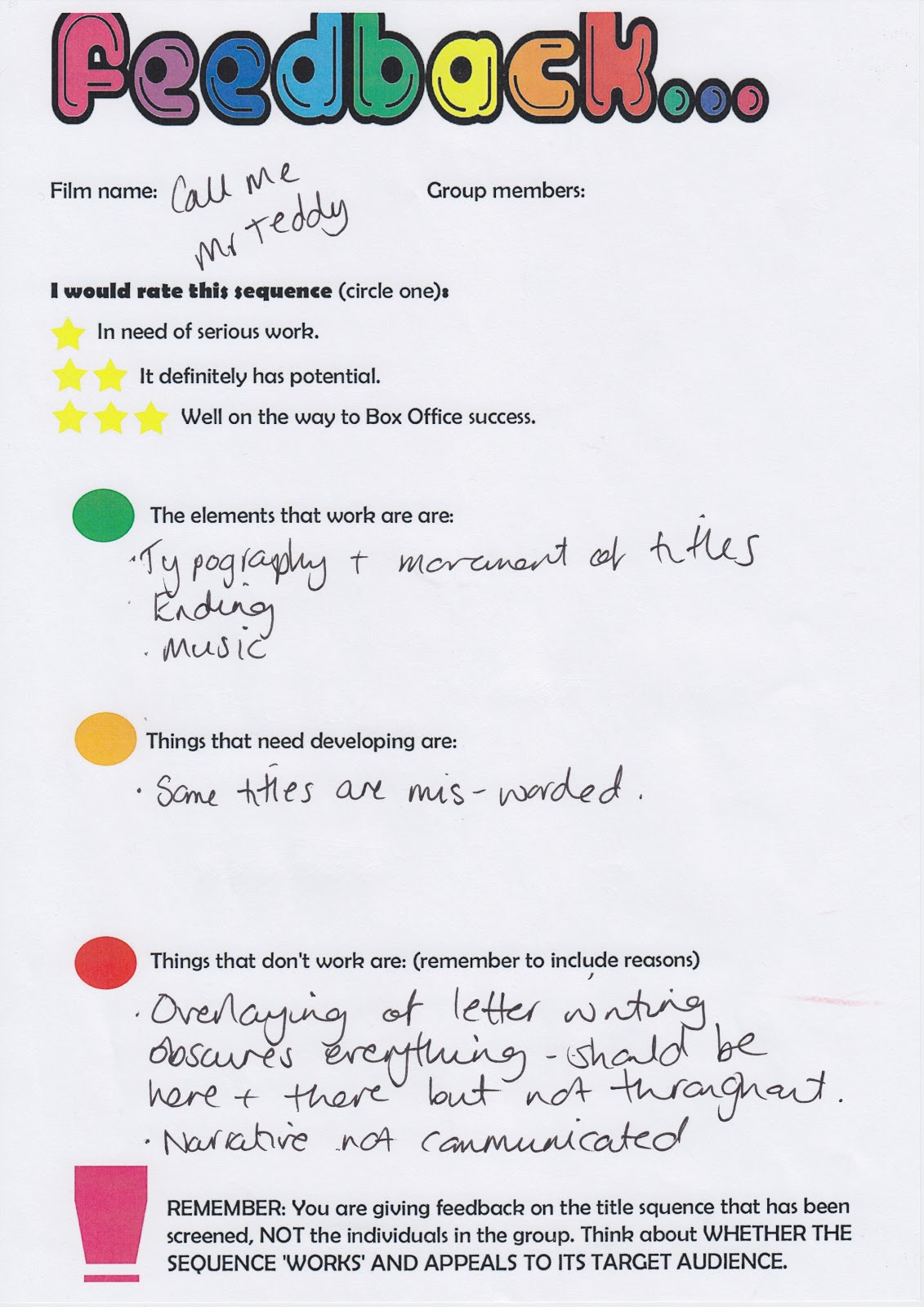
Feedback.
This is the feedback we got from the class after we showed our sequence. One of the main comments were that the audience didn't understand what the film would have been about, after receiving the feedback we decided we agreed with this because we obviously new what the film was about so we didn't really take that on board as much when making the title sequence. And the other main comment was that the music was suitable, we did like this comment because we had worked hard analyzing other music to try and find the perfect one to our title sequence.
Friday, 1 February 2013
30.1.2013
This video shows me, Nicola and Louise explaining the difficulties we encountered and how we over come them.
Sunday, 27 January 2013
Transition research.
Johnny English
- The Johnny English title sequence had text which comes onto the screen for a certain amount of time, long enough for the audience to read it and then it moves to the side as it is running of the screen. I think this suits the genre of the film really well, in my opinion it could resembles chasing after someone, speed and action.
James Bond - Quantum Of Solace
- In the title sequence for Quantum Of Solace the text comes up which relate to the type of film, each letter moves slowly yet swiftly, not all the letters come up at once some pop up before overs which make it kind of look like codes and riddles. This reflects on the film.
Mission Impossible
- When the text in the opening title sequence comes up for Mission Impossible it has the text running through the background and also text in front coming towards you. The behind text seems like it is running away some how and represents the action and the text in front seems like its coming towards you like its going to get you, it also seems like it is closing in on itself.
Friday, 25 January 2013
Transition ideas.
For some ideas for the transition we decided maybe we could have the text appear on the screen for a while and then speed off the screen, I feel this would be a good idea as part of the film could involve 'Mr teddy' being on the run or running after people considering he is a spy it also represents the action genre.
Another one could be it bouncing around because its fun and would be a fun feel to the film although there could be a problem of it not being able to be seen by it moving too much.
One more could be the text fading in and out although I would find this a bit boring and I don't think it would reflect on the film other then maybe the villain hiding from Mr Teddy himself, I don't think its fun or will reflect on the theme.
Another one could be it bouncing around because its fun and would be a fun feel to the film although there could be a problem of it not being able to be seen by it moving too much.
One more could be the text fading in and out although I would find this a bit boring and I don't think it would reflect on the film other then maybe the villain hiding from Mr Teddy himself, I don't think its fun or will reflect on the theme.
Colour.
Today we decided to change the colour red in out font to white, in my opinion I think this is the best thing to do because the red doesn't stand out as well as the white does. We feel the white is best as the white is bright and will reflect on the personalities of the main characters as they will stand out from the crowd as clumsy.
24.1.13
Re-filming
In todays lesson we re-filmed a couple of scenes including the scene were our actor picked up the brief case and money fell out and also the scene were we see our actor at a desk working hard and we pan in to the 'Mr Teddy' logo. We had to re film the scenes because we didn't like the green screen as it didn't look professional and also the dolly looked incredibly wavy it didn't go in a straight line at all. But filming was a success and we got the scenes that we needed in the end.
Title font.
This is our chosen font for the cast and crew, we used simplicity. In my opinion this is a neat font and it doesn't look overly childish, we were looking for a font to resemble his personality and we think this suits it incredibly well. Its neat enough to be serious, spy like writing but at the same time it not so professional. Also it is easy to read for our younger audience.
Subscribe to:
Posts (Atom)


